
PRENO
SETTINGS RE-DESIGN
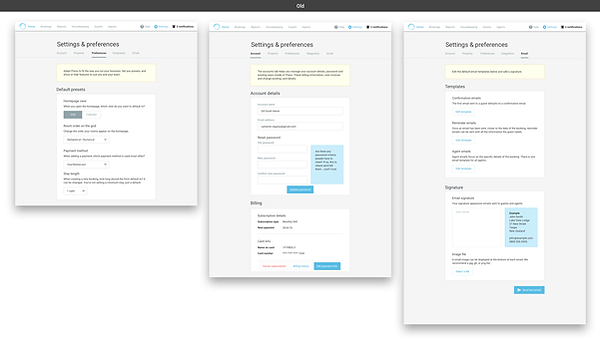
As our customer base grew and differed in size and needs to one another, we saw the need for more customisation and personalisation to our customer's Preno experience.
The redesign included:
1. Making the UI scaleable
2. Re-shuffling and re-grouping areas within Settings
3. Adding new features such as email templates and the ability to add multiple user accounts
This project was a great example of knowing when to break the rules. This design catered to the small amount of settings Preno started off with but we needed the design to scale and we wanted to making it look clean and modern.
Completely changing the design pattern for this area was huge so we broke the project into two parts. Firstly we face-lifted Settings. The we combed through each of the pages on the vertical nav tweaking and designing the way jobs would be done.
Design at Preno is very much a team sport, and I worked closely with our product manager to wireframe and digitally conceptualise.
We user tested before it went into development where I continued to work with our devs to make changes and compromises, and achieve an end result that was close to our designs and efficient to build.
The vertical nav in this redesign has begun to echo through the product.


